


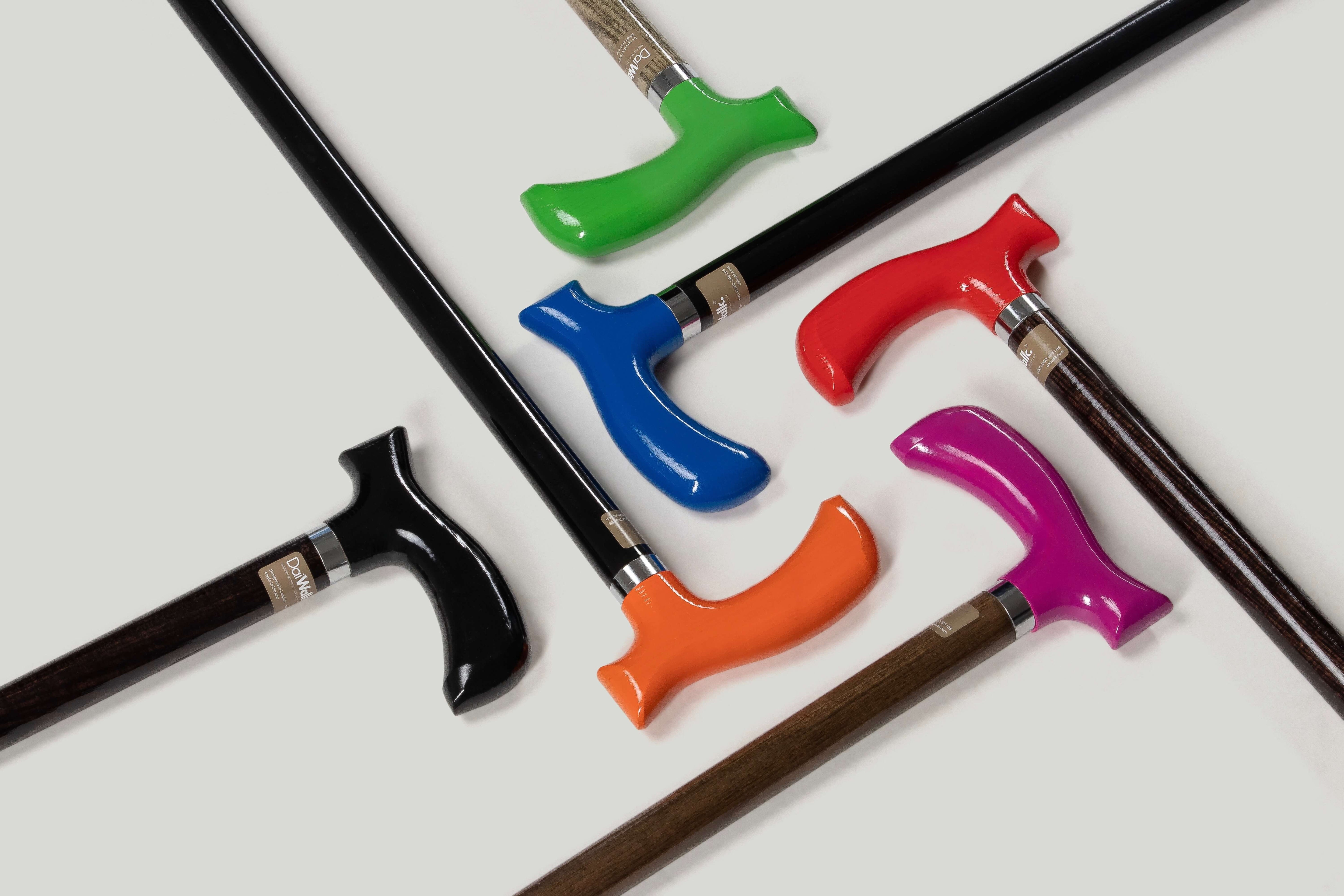
This is the most searched walking cane question that no manufacturer answers directly. The industry's response has been to add colour options to products that still look institutional — a chrome shaft in burgundy is still a chrome shaft.
A walking cane that does not look medical is not achieved through colour alone. It is achieved through a set of design decisions made at the product level — decisions about material, proportion, finish, and visual language. Here is what those decisions are and how to identify them when buying.
Why Most Walking Canes Look Medical Even in Non-Medical Colours
The visual language of a medical product is specific: chrome or powder-coated metal in utilitarian finishes, handle shapes derived from clinical ergonomics rather than design, proportion optimised for function rather than aesthetics, and an overall appearance that communicates institutional origin rather than personal choice.
Adding a burgundy powder coat to this product does not change its visual language. It applies a different colour to the same grammar.
The walking cane does not look medical because of its colour. It looks medical because of what it communicates: that it was designed for a hospital corridor, not for a person.
The Four Design Variables That Change the Visual Language
1. Handle Material
Plastic and powder-coated metal are the materials of medical equipment. They are also the materials of almost every walking cane on the market. They signal clinical origin because that is where they come from — the industrial supply chain that produces hospital equipment.
Natural wood handles communicate something different. Wood is the material of designed objects — furniture, instruments, tools that were made with intention. An oak or wenge handle on a walking cane places the object in a different visual category than a plastic T-bar. It looks like something chosen rather than something issued.
The DaiWalk Original 1.0™ is available with natural oak handle, wenge handle, or black alloy. The wood options are not decorative — they use real timber with real grain, sourced for handle quality. See the Oak Walking Canes and Handcrafted Walking Canes collections for the full material breakdown.
2. Colour Applied to the Right Element
The visible element of a walking cane — the part people see as you carry it — is the handle, not the shaft. The shaft is mostly vertical and largely invisible in peripheral vision. The handle is horizontal and at a height where it is consistently in sightlines.
Applying colour to the shaft (as most coloured canes do) has limited visual impact. Applying colour to the handle changes the identity of the object.
DaiWalk applies colour to the handle in seven options: Stealth Black, Deep Blue, Fuchsia, Vibrant Red, Traffic Yellow, Forest Green, and Vibrant Orange. Each is a deliberate chromatic choice — not a colour selected to evoke medical caution or institutional neutrality. The full palette is in the Colorful Walking Canes collection.
3. Proportion and Finish
Medical canes are proportioned for function. The handle is the right size for grip, the shaft is the right diameter for strength, and the overall appearance is determined by these functional constraints without aesthetic editing.
A designed walking cane applies aesthetic editing to the same functional constraints. The DaiWalk Original 1.0™ shaft diameter, handle proportions, and collar design were arrived at through a process that included aesthetic decisions — what looks right alongside what works. The laser-engraved Signature ID on the steel collar, for example, serves no functional purpose. It is a detail that communicates that the object was made with attention — the same signal as a serial number on a watch.
4. Visual Cohesion
A medical cane is an assembly of components that were not designed to look good together. The handle is one manufacturer. The shaft is another. The tip is a generic ferrule. The result is visual incoherence — different surface qualities, different proportions, different implied origins.
A designed cane is a system. Every component was designed together. On the DaiWalk Original 1.0™, the handle colour, shaft finish, collar engraving, and tip colour are all part of the same visual vocabulary. The 3D configurator on the product page exists because the combinations matter — seeing them rendered before ordering is part of the design proposition.
The POP™ Series: When You Want No Ambiguity
If the goal is a walking cane that is unambiguously a design object — where the visual statement is explicit rather than implicit — the DaiWalk POP™ series removes all remaining medical visual language.
Each POP™ cane is individually hand-painted by artists. The painting covers the entire shaft surface. No two are identical. The object that results has no visual relationship to a hospital corridor product. It looks like what it is: a piece of applied art that also functions as a mobility aid.
Starting at $137. The hand-painting is real labour — each piece takes several hours to complete.
The Colour Selection Question
If you are choosing an Original 1.0™ handle colour with the aim of not appearing medical, the relevant frame is not which colour is least medical-looking — they all are — but which colour serves your actual wardrobe and context.
| Handle Colour | Visual Context | Best Wardrobe Pairing |
|---|---|---|
| Stealth Black | Deliberate, minimal, versatile | Everything — the choice when you want the cane to integrate |
| Deep Blue | Neutral with character | Navy, denim, charcoal, grey |
| Fuchsia | Warm, confident | Neutrals, ivory, cream, white |
| Vibrant Red | Bold, classic statement | Black, white, denim |
| Traffic Yellow | Industrial, unexpected | Black, white, high-contrast looks |
| Forest Green | Organic, considered | Earth tones, tan, brown, white |
| Vibrant Orange | Warm, energetic | Cream, black, brown — our most popular colour |
The 3D configurator on the DaiWalk product page renders any handle colour with any shaft finish and tip combination before you order. Use it. The visual difference between configurations is significant and not adequately conveyed by product photos alone. Not sure which combination suits you? The free walking cane finder narrows it down from three quick questions.
What to Avoid When Buying for Non-Medical Aesthetics
- Chrome shafts: The most medical-looking finish available. Regardless of handle colour, a chrome shaft reads as clinical equipment.
- Transparent plastic handles: Common in fashion cane products. Look cheap rather than designed.
- Foam handle wraps: Applied to existing T-bar shapes to add soft texture. The underlying geometry remains medical. The foam signals therapeutic rather than designed.
- T-bar shape in any material: The T-bar is the primary visual marker of a medical walking cane. If the handle is a horizontal cylinder, the object reads as medical regardless of what it is made of.
The DaiWalk Original 1.0™ does not use a T-bar handle. The Anatomic Grip™ has a distinct profile — not a horizontal cylinder. This is visible in the product photos and renders in the 3D configurator. It is also why the peak handle pressure is 1.9 N/cm² rather than 4.2 N/cm² — the geometry that looks different is also the geometry that performs differently.
Full design details, configuration tool, and specification on the DaiWalk product page.
Related Reading
- Walking Canes and Style: How to Carry Yours With Intention
- Walking Cane for Young Adults: Breaking the Stigma, Keeping the Style
- The Walking Cane as a Design Object
- Walking Cane Buying Guide 2026
Design language analysis from DaiWalk product development documentation. Colour preference data from customer order history. Visual communication principles applied from industrial design practice. Handle geometry visual characterisation from DaiWalk internal design brief.


